728x90
React에서 CSS를 입힐 때 여러모로 불편한 점이 많다.
css파일을 import 해서 사용하면 class 이름을 일일이 관리해주어야하고 인라인으로 작성된다면 가독성이 좋지 않다. 중복되는 코드들도 해결하고 싶은경우가 많다.
이러한 불편한 점을 많이 해소해주는 것이 styled-components이다.
https://styled-components.com/docs
styled-components: Documentation
Learn how to use styled-components and to style your apps without stress
styled-components.com
styled-components 문서에서 다양한 기능들을 확인해 볼 수 있다.
간단한 사용법은 아래와 같다
import styled from 'styled-components';

const StyledComponent이름 = styled.HTML태그`
  /* CSS code */
`;

function App() {
  return (
    <StyledComponent이름>
    </StyledComponent이름>
  );
}
examples
  ...
  return (
    <div style={{ display: "flex" }}>
        <div style={{backgroundColor: "teal", width: 100, height: 100}}></div>
        <div style={{backgroundColor: "tomato", width: 100, height: 100}}></div>
    </div>
  );

...이런 코드를 styled-components를 사용하면 좀 더 깔끔하고 편하게 사용할 수 있다.
import styled from 'styled-components';

const Father = styled.div`
  display: flex;
`;

const BoxOne = styled.div`
  background-color: teal;
  width: 100px;
  height: 100px;
`;

const BoxTwo = styled.div`
  background-color: tomato;
  width: 100px;
  height: 100px;
`;

function App() {
  return (
    <Father>
      <BoxOne />
      <BoxTwo />
    </Father>
  );
}같은 기능을하는 컴포넌트의 중복된 코드를 줄이고 재사용 할 수 있다.
import styled from 'styled-components';

const Father = styled.div`
  display: flex;
`;

const Box = styled.div`
  background-color: ${props => props.bgColor};
  width: 100px;
  height: 100px;
`;

function App() {
  return (
    <Father>
      <Box bgColor="teal" />
      <Box bgColor="tomato" />
    </Father>
  );
}

export default App;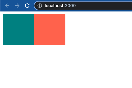
상속을 받아서 중복된 코드들을 줄이고 더 확장시킬 수 있다.
import styled from 'styled-components';

const Father = styled.div`
  display: flex;
`;

const Box = styled.div`
  background-color: ${props => props.bgColor};
  width: 100px;
  height: 100px;
`;

const Circle = styled(Box)`
  border-radius: 50px;
`;

function App() {
  return (
    <Father>
      <Box bgColor="teal" />
      <Circle bgColor="tomato" />
    </Father>
  );
}

export default App;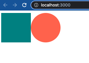
만약 수 많은 Input이 있을 때 모두 필수 값으로 지정하고 싶을 때 컴포넌트 생성시 속성을 지정할 수 있다.
import styled from 'styled-components';

const Father = styled.div`
  display: flex;
`;

const Input = styled.input.attrs({ required: true })`
  background-color: whitesmoke;
`;

function App() {
  return (
    <Father>
      <Input />
      <Input />
      <Input />
    </Father>
  );
}

export default App;
animation 사용하기
styled-components에서 css animation을 사용하기 위해서는 keyframes를 import 해주어야 한다.
from ~ to : 시작부터 끝까지의 단계로 애니메이션을 준다.
import styled, { keyframes } from 'styled-components';

const Wrapper = styled.div`
  display: flex;
`;

const rotationAnimation = keyframes`
  from {
    transform: rotate(0deg);
  }
  to {
    transform: rotate(360deg);
  }
`;

const Box = styled.div`
  height: 100px;
  width: 100px;
  background-color: tomato;
  animation: ${rotationAnimation} 1s linear infinite;
`;

function App() {
  return (
    <Wrapper>
      <Box></Box>
    </Wrapper>
  );
}

export default App;0~100%로 구간을 나눌 수 도 있다.
import styled, { keyframes } from 'styled-components';

const Wrapper = styled.div`
  display: flex;
`;

const rotationAnimation = keyframes`
  0% {
    transform: rotate(0deg);
    border-radius: 0px;
  }
  50% {
    transform: rotate(360deg);
    border-radius: 50px;
  }
  100% {
    transform: rotate(0deg);
    border-radius: 0px;
  }
`;

const Box = styled.div`
  height: 100px;
  width: 100px;
  background-color: tomato;
  animation: ${rotationAnimation} 1s linear infinite;
`;

function App() {
  return (
    <Wrapper>
      <Box></Box>
    </Wrapper>
  );
}

export default App;728x90
300x250