
MUI의 모든 컴포넌트들은 기본적으로 style이 지정되어있다. 스타일을 변경하기 위해서 여러가지 방법이 존재한다.
class명을 지정해서 css파일을 통한 지정
// test.css
.test {
  backgroundColor:'white';
}

// test.jsx
const Test = () => {
  return <div className='test'>hi</div>
}
컴포넌트 인라인 스타일 조정
<div style={{backgroundColor:'white'}}>
// MUI 컴포넌트들에도 inline style을 먹일 수 있다.
// ex) <Box style={{}} />
// sx와 style의 차이는 이전 글에
<Box sx={{backgroundColor:'white'}}>https://wonillism.tistory.com/287
[MUI] <div> VS <Box> / sx VS style
vs mui에 대해 자료를 조사하다보면 성능에 대한 이슈를 종종 찾아볼 수 있다. 그래서 과거의 글들을 찾아보면 Box보다는 div를 써라는 말도 자주 찾아볼 수 있다. mui - React Box - Material UI The Box compon.
wonillism.tistory.com
styled-component를 이용한 스타일 조정
const StyledTest = styled('div')`
	background-color:"white";
`;

const Test = () => {
	return <StyledTest>hi</StyledTest>
}
theme Overriding
css파일, inline style, styled-component는 리액트에서 익숙한 방법이다. 하지만 theme Overriding 방법은 조금 익숙하지 않다.
MUI 설치
- yarn add @mui/material @emotion/react @emotion/styled
- yarn add @mui/icons-material
theme 를 이용하면 MUI를 사용자 정의해서 사용할 수 있다. 컴포넌트들의 색상, 표면의 어둠, 그림자 수준, 불투명도 등을 지정할 수 있으며 일관된 톤을 앱에 적용할 수 있다. 즉, 프로젝트의 설계 측면을 사용자 정의할 수 있다.
MUI는 기본적으로 emotion이라는 자체 engine을 사용하지만 , styled-components와 함께 쓰려면 별도로 styled-component engine을 설치해주어야 한다.
- yarn add @mui/styled-engine-sc styled-components
styeld (MUI vs styled-components)
// MUI
const StyledMUI = styled('div')(({theme})=>({
	color:"blue";
}));

// styled-component
const StyledSC = styled('div')`
	color:blue;
`;
우선 문법상으로 조금 차이가 있다. MUI의 경우 설정되어있는 theme값을 가져와서 쓸 수 있도록 함수형태로 제공되는 반면, styled-component는 css문법 그대로 사용된다.
아무래도 theme 적용이 불필요한 경우에는 굳이 MUI의 styled를 사용할필요가 없지 않을까? 라고 생각해서 styled-component와 혼용하기로 결정했다.
우선은 styled component를 적용시키기 위해서는 아래와 같이 최상단 index.tsx에 <StyledEngineProvider injectFirst> 를 이용해서 묶어주면된다.
src/index.tsx
...
import { StyledEngineProvider } from "@mui/material";

const root = ReactDOM.createRoot(
  document.getElementById("root") as HTMLElement
);
root.render(
  <React.StrictMode>
    ...

    <StyledEngineProvider injectFirst>
      <App />
    </StyledEngineProvider>

		...
  </React.StrictMode>
);
theme 설정을 하려면 또 index.tsx 에 <ThemeProvier> 를 감싸 주어야 한다. 덕지덕지 될 수록 코드가 지저분해지니 mui 관련 theme 설정을 한꺼번해 해주자.
src/theme/index.tsx
import React, { ReactNode } from "react";
import {
  createTheme,
  CssBaseline,
  StyledEngineProvider,
  ThemeProvider,
} from "@mui/material";

interface ThemeConfigProps {
  children: ReactNode;
}

const ThemeConfig = ({ children }: ThemeConfigProps) => {
  const theme = createTheme();
  return (
    <StyledEngineProvider injectFirst>
      <ThemeProvider theme={theme}>
        <CssBaseline />
        {children}
      </ThemeProvider>
    </StyledEngineProvider>
  );
};

export default ThemeConfig;
src/index.tsx
...
import ThemeConfig from "./theme";

const root = ReactDOM.createRoot(
  document.getElementById("root") as HTMLElement
);
root.render(
  <React.StrictMode>
    <ThemeConfig>
      <App />
    </ThemeConfig>
  </React.StrictMode>
);
프로젝트 전역에 theme 설정을 뿌려주기 위해 <ThemeProvider> 를 감싸주고 그 안에 <CssBaseline /> 을 추가 해준다.
<CssBaseline /> 는 어떤 브라우저든 상관없이 일괄적인 스타일을 적용하기 위해 CSS를 전역에서 정규화 시켜주는 컴포넌트이다.
Theme setting

theme를 이용하면 아래 요소들을 설정할 수 있다.
- palette : 프로젝트에 사용할 기본적인 구성요소들의 색을 지정
- primary
- secondary
- error
- warning
- info
- success
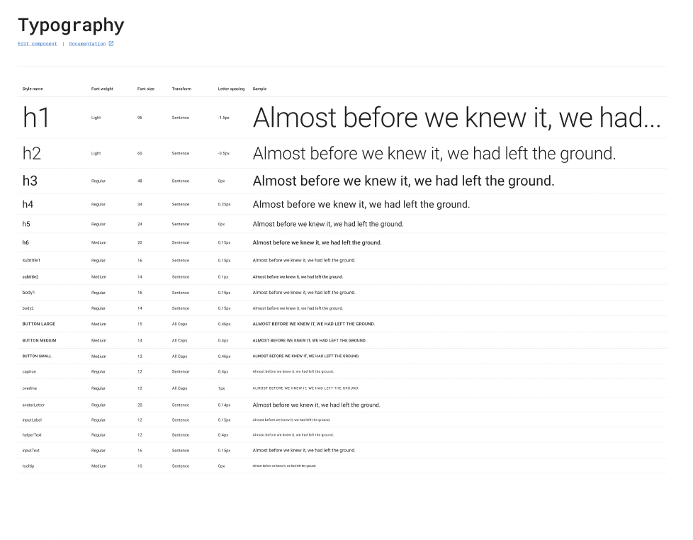
- typography : 프로젝트에 사용할 기본적인 폰트, 폰트의 크기, 자간, 폰트의 두깨를 지정
- h1
- h2
- h3
- h4
- h5
- h6
- subtitle1
- subtitle2
- body1
- body2
- button
- caption
- overline
- spacing : 프로젝트에 사용할 간격을 지정
- breakpoints : 반응형 구성을 위해 중단점을 미리 설정할 수 있다.
- zIndex : 요소들의 z-index를 미리 설정할 수 있다.
- transitions
- components : MUI 기본 컴포넌트들을 overriding하여 사용할 수 있다.
사용법
src/theme/index.tsx
import React, { ReactNode, useMemo } from "react";
import {
  createTheme,
  CssBaseline,
  StyledEngineProvider,
  ThemeOptions,
  ThemeProvider,
} from "@mui/material";

interface ThemeConfigProps {
  children: ReactNode;
}

const ThemeConfig = ({ children }: ThemeConfigProps) => {
	// MUI 초기 theme 값
	const defaultTheme = createTheme();
	// 수정될 theme 값
	const themeOptions: ThemeOptions = useMemo<ThemeOptions>(
    () => ({
      palette: {
        primary: {
          light: "#0092FF",
          main: "#5586FD",
          dark: "#53648E",
          contrastText: "#FFFFFF",
        },
        secondary: {},
        error: {},
        warning: {},
        info: {},
        success: {},
      },
      typography: {
        fontFamily: "Noto Sans",
        h1: {
          fontWeight: 900,
          fontSize: "60px",
          letterSpacing: "-0.02em",
        },
        h2: {},
      },
      spacing: {},
      breakpoints: {
        values: {
          xs: 0,
          sm: 600,
          md: 900,
          lg: 1024,
          xl: 1440,
        },
      },
      zIndex: {},
      transitions: {},
      components: {},
    }),
    []
  );

	// 수정된 theme 적용
  const theme = createTheme(themeOptions);

  return (
    <StyledEngineProvider injectFirst>
      <ThemeProvider theme={theme}>
        <CssBaseline />
        {children}
      </ThemeProvider>
    </StyledEngineProvider>
  );
};

export default ThemeConfig;